


Sales-Led vs Product-Led SaaS Websites: Key Design Differences
Discover the key design differences between sales-led and product-led SaaS websites, including CTAs, pricing, forms, product proof and conversion goals.

We’ll review your website, identify conversion gaps, and outline a practical plan to turn it into a qualified lead engine.


Two SaaS companies can sell at a similar price point, to a similar buyer, inside the same category, and still need websites that look nothing alike. The reason is rarely taste. It is the go-to-market motion sitting behind the site. A sales-led company needs its website to find, qualify and route buyers so a human can carry the conversation forward. A product-led company needs its website to move someone into the product with as little friction as possible, then let the product do the persuading.
When that distinction is ignored, the website quietly works against the business. Sales-led teams end up with a signup button that fills the pipeline with people who will never buy. Product-led teams bury a free plan behind a contact form and wonder why activation stays flat. The layout looks fine in both cases. The motion underneath does not match.
Key things to know:
- Why the primary call to action is the single design decision that separates the two models
- How navigation and page depth change when the buyer is a committee instead of one user
- How much pricing detail each model can publish, and what hiding it costs you
- Why product visuals shift from polished screenshots to interactive proof once self-service is the goal
- Which form fields actually help qualification, and where friction becomes expensive
- Why most growing SaaS companies end up running both motions, and how to design for that
- The metrics each model should track, and why the same conversion rate can mean two different things
The motion behind the design
A sales-led SaaS company sells through people. Deal sizes justify a cycle measured in weeks or months, the buying group includes stakeholders who never touch the product, and procurement, security review and legal all sit somewhere on the path. The website exists to create qualified conversations, so every design decision points toward a booked call.
A product-led company sells through the product itself. Someone signs up, reaches a moment of value on their own, and either upgrades or invites colleagues. Revenue expands from inside accounts rather than arriving through a contract negotiation. Here the website exists to get the right person to the signup step quickly and to remove every reason to hesitate on the way.
Buyer behaviour has been moving toward self-service for years, and a Gartner sales survey of 646 B2B buyers found that 67% now prefer a rep-free buying experience. That does not mean sales teams are disappearing. It means the website carries more of the work a rep used to do in a first call, whichever model a company runs.
The hero section: one decision, two answers
The hero is where the two models separate most visibly.
A sales-led hero has one job: state who the product is for, what outcome it creates, and offer a call. The headline speaks in business outcomes rather than features, because the person reading it may be approving budget rather than using the tool. The primary button says something specific like "Book a 20-minute walkthrough" instead of "Get started", since "Get started" implies self-service that does not exist. A secondary action points to a case study or short product tour for the researcher who is not ready to talk.
A product-led hero does the opposite. It names the job the product does, shows the interface, and puts the signup path in the first viewport. The button says "Start free", and the supporting line removes objections before they form: no credit card, free plan available, set up in minutes. If there is a demo option, it sits second, styled as the quieter choice.
The mistake we see most often on conversion-focused B2B web design projects is a hero that hedges. Two buttons of equal weight, one saying "Start free trial" and one saying "Talk to sales", with nothing telling the visitor which is meant for them. The visitor picks neither.
Navigation and page depth
Sales-led sites are usually deeper. The buying group needs different pages for different roles, so the structure often includes solution pages by industry or company size, a security page, an integrations page that procurement will check, and case studies organised so a prospect can find a company that resembles their own. Navigation is built around "who are you and what problem do you have", because the site has to serve a CFO, an IT lead and an end user in the same week.
Product-led sites tend to be flatter and more feature-led. Users arrive knowing roughly what they want and need to confirm the product does that specific thing. Navigation follows the product: features, use cases, pricing, docs, changelog. Documentation often sits in the main menu rather than the footer, because for a self-serve buyer the docs are part of the evaluation. A developer will read your API reference before they read your homepage.
Both models share one structural point. As page count grows, the CMS structure decides whether the marketing team can keep shipping without engineering help. It is worth reading about whether Webflow can scale with a fast-growing SaaS company before committing to a structure you will outgrow in a year.
Pricing pages carry different weight
On a product-led site, the pricing page is frequently the second or third most visited page and often the last one someone sees before signing up. It has to answer everything on its own: what each tier includes, where the limits sit, what happens when a team outgrows a plan, and what the free option actually allows. Vague pricing on a self-serve site creates the exact hesitation the model is designed to avoid.
Sales-led pricing works differently, because the number depends on seats, modules, contract length and negotiation. Hiding it entirely still costs you. A buyer comparing three vendors will discard the one that gives them nothing to work with. The middle ground is publishing the shape of the pricing rather than the figure: what the tiers are called, what each includes, and what drives cost up or down. Our own pricing page follows that logic, with starting figures and a clear description of each engagement type.
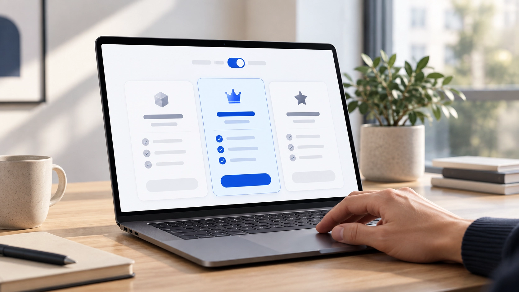
If you sell through both motions, the cleanest pattern is self-serve tiers with real numbers on the left and an enterprise tier with a contact route on the right. The visitor sorts themselves without being asked.
Showing the product
Sales-led sites present the product carefully. Screenshots are cropped, annotated and chosen to illustrate a business outcome rather than a workflow. The detail lives in the demo, where a rep can tailor the story to the account. That is reasonable when the product is complex and a raw interface screenshot would confuse more than it convinces.
Product-led sites cannot rely on that. The visitor is deciding whether to invest twenty minutes in a signup, and wants evidence the product will work for them before spending it. That pushes the design toward interactive tours, short looping clips of a real workflow, embedded sandboxes and templates someone can open without an account. The product visual stops being decoration and becomes the main argument on the page.
Both approaches carry the same technical cost: heavy assets lose conversions. Google's published Core Web Vitals data includes Vodafone improving Largest Contentful Paint by 31% and recording 8% more sales, and Agrofy Market cutting load abandonment by 76% after a 70% LCP improvement. A product tour that takes six seconds to appear is not proof of anything, which is where careful Webflow development earns its keep.
Social proof for two different audiences
Sales-led social proof is about risk reduction for a committee. Recognisable logos from companies of a similar size, named quotes from people in the buyer's role, quantified results with a clear before and after, and security certifications. The format that carries the most weight is the full case study, which is why it deserves its own section rather than a line in the footer. Our case studies follow that pattern, leading with the problem and the measurable outcome rather than the visual work.
Product-led social proof is about momentum and peer validation. Usage counts, review scores from platforms the audience trusts, community size, template galleries and public changelogs all signal that the product is alive and widely used. A developer evaluating a tool cares less about a CFO testimonial than about whether the repository was updated last week.
The placement rule is the same for both. Proof belongs next to the moment of doubt, not collected in one band halfway down the page. Put the security badge next to the signup form. Put the customer quote next to the claim it supports.
Forms, friction and qualification
This is where the two models pull hardest in opposite directions.
A sales-led form is a qualification tool. Company size, role, use case and timeline help route the lead and prepare the call, and a slightly longer form filters out people who were never going to buy. Every field still has to earn its place. If nobody in sales uses the answer, remove the field. Multi-step forms that ask the easy questions first usually complete better than one long block.
A product-led signup is the opposite problem. Email and password, or a single sign-on button, and nothing else. Anything you need to know can be asked during onboarding, once the user is already invested. Asking for a phone number before someone has seen the product is the fastest way to lose them.
Self-service and human contact are not mutually exclusive, though. The same Gartner research found that 69% of B2B buyers still turn to sales reps to validate AI-generated insights, and that 51% worry about misleading information from generative AI tools. Buyers want to move on their own, then confirm their thinking with a person. A product-led site that makes it impossible to reach a human at the decision point is leaving revenue behind.
What each model should measure
The same conversion rate can mean two different things depending on the motion.
A sales-led site should be judged on qualified pipeline, not form fills. Useful numbers include demo requests that pass qualification, the share that book and attend, and time from first visit to first meeting. A rising form fill rate paired with a falling qualification rate is a warning, not a win.
A product-led site should be judged on activation rather than signups. Signup rate matters, but only alongside the percentage of signups reaching a first value moment, free to paid conversion, and time to that moment. A wider set of indicators is worth tracking on either model, covered in our piece on key UX metrics for SaaS teams.
When the two models live on one site
Most SaaS companies do not stay purely one or the other. Product-led companies add a sales team once enterprise deals appear. Sales-led companies add a free tier to widen the funnel. The website has to handle both without becoming a compromise that serves neither.
A few patterns hold up in practice:
- Keep one primary call to action per page rather than one per site. The homepage can lead with self-serve signup while the security page leads with a call to sales.
- Split the paths at pricing, where visitors are already sorting themselves by budget and company size.
- Build dedicated enterprise pages that speak the language of procurement.
- Keep a visible contact route on self-serve pages, sized as a secondary option rather than a competing one.
- Track the two funnels separately. Blending them produces an average that describes nobody.
Companies preparing for a funding round face a related version of this, since investors and customers read the same site with different questions in mind. We covered that tension in our notes on website priorities before fundraising.
Choosing the right model for your website
Three questions usually settle it.
First, can someone reach real value in your product without help from your team? If onboarding needs data migration, configuration or training, a product-led site will generate signups that stall.
Second, does the price support a sales cycle? A contract in the low thousands per year rarely covers several calls, a security review and a procurement process.
Third, who signs? If the person who benefits from the product also pays for it, the path can be self-serve. If the buying group includes people who will never open the product, the site has to persuade them separately, and that is sales-led design work.
Moving from one model to the other means structural change rather than a new coat of paint. A site built around demo requests does not become product-led by swapping button labels. The information architecture, the pricing page, the product visuals and the onboarding entry point all shift. That is often where a Webflow migration makes sense, since rebuilding the structure is usually less work than retrofitting it.
Final thoughts
Sales-led and product-led websites are not two design styles to pick between on aesthetic grounds. They are two different arguments made to two different kinds of buyer, and the layout is what that argument looks like on screen. A sales-led site earns a conversation. A product-led site earns a signup. Both can be beautiful, and both fail the moment the design points somewhere the business does not.
The practical test is simple. Open your homepage, read the primary button, and ask whether it matches how your customers buy today rather than how they bought two years ago. If the answer is no, the fix is structural, and it is worth starting before another quarter of paid traffic runs through a site pointing the wrong way.
If you are weighing up which model your website should be built around, book a free strategy call and we will walk through it with you.
FAQs
How do I know whether my SaaS website should be sales-led or product-led?
Start with how customers actually buy. If prospects usually need demos, security reviews, procurement, implementation support or several stakeholders before signing, the website should support a sales-led journey. If users can sign up, reach value and upgrade largely on their own, a product-led structure is usually the better fit.
What should the primary CTA be on a sales-led SaaS website?
The main CTA should move qualified buyers toward a real sales conversation, with wording such as “Book a demo” or “Talk to sales.” It should be specific about what happens next rather than using vague language such as “Get started.” A secondary CTA can serve visitors who are still researching, for example with a case study or product tour.
Why is transparent pricing more important for product-led SaaS?
A product-led buyer is expected to make much more of the decision without speaking to sales. That means the pricing page needs to explain plans, limits, upgrade paths and any free option clearly enough for someone to choose independently. Hidden or vague pricing introduces friction at exactly the point where a self-service model is supposed to remove it.
Can one SaaS website support both product-led and sales-led growth?
Yes, and many growing SaaS companies eventually need both. The key is to give each audience a clear path rather than presenting two equally weighted CTAs everywhere. Self-serve visitors can be directed toward signup and transparent pricing, while enterprise buyers can move toward dedicated pages, security information and a sales conversation.
Should a product-led SaaS website still offer a way to contact sales?
Usually, yes. Even buyers who prefer self-service may want human reassurance when the decision becomes more complex, especially around security, migration, pricing or larger team rollouts. The sales route should remain visible, but it should normally be secondary to the signup path on product-led pages.
What metrics should sales-led and product-led SaaS websites track differently?
A sales-led site should focus on qualified pipeline, demo quality, meeting attendance and how website activity contributes to opportunities. A product-led site should look beyond signup rate to activation, time to first value and free-to-paid conversion. Treating both models as if the same conversion metric defines success can hide whether the website is actually supporting the way customers buy.

We’ll review your website, identify conversion gaps, and outline a practical plan to turn it into a qualified lead engine.

.png)