


Third Redesign. First Time It Actually Worked
Smartclick is an SEO agency working for B2B SaaS companies ready to turn organic traffic into predictable revenue.
Smartclick is an SEO agency working for B2B SaaS companies ready to turn organic traffic into predictable revenue.
Dec. 2024 - Ongoing

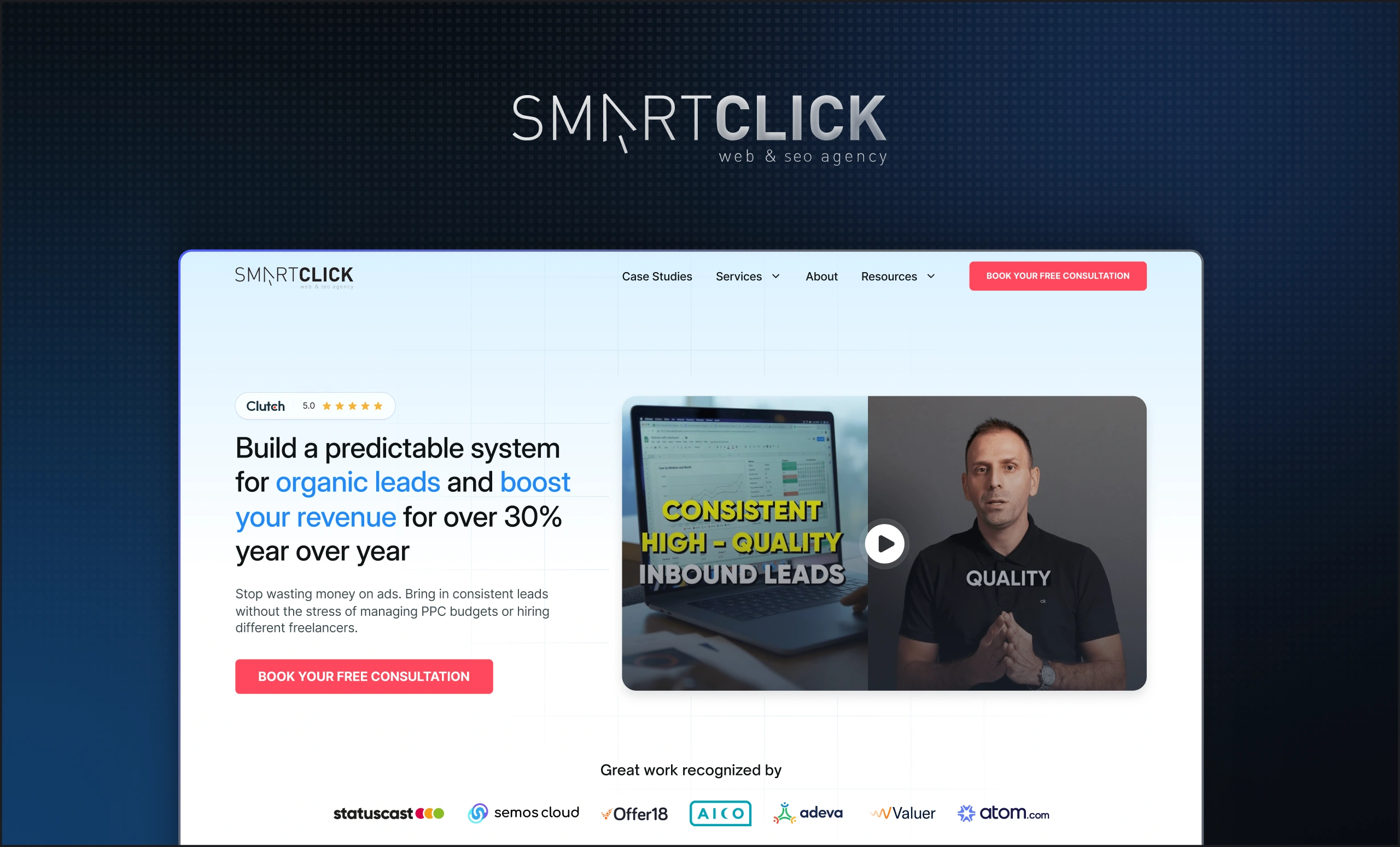
Smartclick is an SEO agency that works with B2B SaaS companies. And they're very good at it. A team of 15 experts helping some of the most competitive software companies in the world win on search.
Their clients are serious. Their work is serious. The website needed to be too.
It wasn't.
The Challenge
By the time Smartclick came to us, they had already tried to fix this twice.
First, an internal attempt. The kind of redesign that gets halfway done before the day job takes over. Then a freelancer, someone who could execute visually but didn't have the strategic foundation to build something that would actually hold. Two redesigns. Two outcomes that didn't stick. And a website that still didn't reflect the calibre of the company behind it.
The problem wasn't effort. It was that both attempts were solving for the surface — better visuals, a fresher layout — without addressing what was actually missing underneath. There was no design system. No shared language. No foundation that could scale as the company grew and as the brand touched more and more channels.
Every time something new needed to be designed, it was starting from scratch. And it showed.
The Solution
We came in and did what the previous attempts hadn't. We started with the foundation.
Working simultaneously on the website redesign and the design system, every decision we made fed both. The website wasn't designed in isolation, it was designed as the first expression of a larger visual language that we were building at the same time. Typography, color, spacing, components, patterns, all defined, all documented, all connected.
The result was a website that finally looked like Smartclick. Confident. Credible. The kind of design that makes a B2B buyer feel like they're in the right hands before they've read a single word.
But what happened next is what makes this case study worth writing.
Smartclick's team quickly realised the design system wasn't just useful for the website. It was useful for everything. LinkedIn ads. Social media content. Creatives. Blog visuals. Podcast artwork. The founder's personal website. Every single marketing touchpoint, pulled under the same visual umbrella for the first time. One system. Total consistency. A brand that compounds every time it shows up somewhere new.
We also set up proper analytics on the website, so Smartclick could stop guessing and start making data-driven decisions about what was working and what wasn't. And after handing off to their development team, we ran full QA on the implementation to make sure what was built matched what was designed. No gaps. No drift.
The Results
The numbers came quickly.
- 34% increase in conversions within the first four months
- Full brand system now active across website, ads, social, podcasts, and founder presence
- Analytics infrastructure in place for ongoing data-driven decisions
- Development QA completed, design integrity maintained end to end
More than the metrics, something shifted in how Smartclick was perceived. The brand looked serious. It looked trustworthy. It looked like a company that Fortune 500 SaaS teams could hand their SEO strategy to without a second thought.
Three attempts to get the website right. The difference the third time wasn't trying harder. It was building the right foundation first.
That foundation is still growing. Smartclick is still with us, and every month, the system we built together gets used in ways we're still expanding.
"Flowscape redesigned our website into something cleaner, faster, and far more effective. The rollout was seamless, and soon after launch we saw increases in both traffic and conversions."

Explore more case studies

Let’s turn your website into a growth engine


