


Startup Website Design: What Early-Stage Companies Actually Need
Startup website design tips for early-stage companies that need clearer messaging, better conversions, mobile-friendly pages and simpler user journeys.
We’ll review your website, identify conversion gaps, and outline a practical plan to turn it into a qualified lead engine.


Early-stage startups need simple, high-converting websites that build trust quickly, explain the product clearly, and turn visitors into users without unnecessary complexity.
Key things to know:
- Why 1–2 focused landing pages often perform better than large, multi-page websites for early-stage startups
- How strong design builds instant credibility, with users judging trustworthiness in a fraction of a second
- Why startup websites should be built for users first, since traction is what investors actually care about
- The importance of clear messaging that explains what you do, who it is for, and why it matters
- How frictionless signup flows, strong CTAs, and mobile responsiveness improve conversions
- Common mistakes to avoid, including overbuilding, vague copy, and designing for investors instead of customers
Remember: Your website isn't just a digital brochure—it's your most important marketing asset and growth engine that works 24/7 to build trust, generate leads, and drive conversions. Website design matters nowhere near as much as startup founders think—94% of first impressions relate to design. A new business's digital presence becomes the first point of contact with potential customers and investors.
Building an effective startup website doesn't require a complex, multi-page design. A good agency can create your website in just two weeks. The focus should be on what truly matters: a user-friendly design with easy-to-use navigation and clear call-to-action buttons that boost conversion rates. Time matters in making first impressions—47% of users abandon websites that take more than two seconds to load.
Early-stage companies need simplicity and strategic focus instead of complexity. Your website represents your digital identity and must attract customers while impressing investors. In this piece, we'll show what startups really need for their websites. We'll explain why user acquisition deserves priority and help you avoid common mistakes that can damage your online presence.
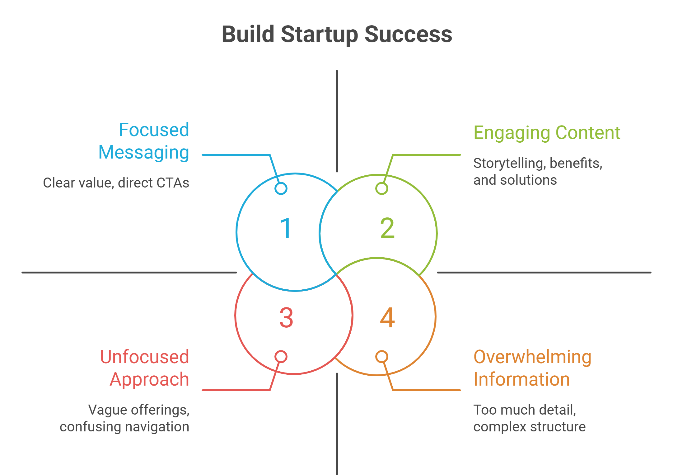
Early-stage startups need focused, user-centered websites that prioritize clarity and conversion over complexity. Here are the essential insights for building an effective startup website:
- Keep it simple: 1-2 focused landing pages outperform complex multi-page websites for early-stage startups by up to 86% when designed strategically.
- Design builds instant trust: 94% of first impressions are design-related, and users form credibility judgments in just 50 milliseconds—making professional appearance crucial.
- Prioritize users over investors: User-centered design drives the traction that investors actually care about, with satisfied customers spending 140% more.
- Eliminate friction everywhere: Reduce signup barriers, use clear CTAs with action verbs, and ensure mobile responsiveness since 70% of users access sites via mobile.
- Message with crystal clarity: Avoid jargon and vague taglines—clear, direct messaging can double conversion rates compared to complex industry speak.
- Future-proof from day one: Choose scalable platforms, implement SEO and analytics immediately, and build with accessibility in mind to avoid costly redesigns later.
Why Website Design Matters for Early-Stage Startups
Your startup's website makes an instant impression on potential customers. Users make snap judgments about website credibility in just 50 milliseconds—faster than a blink of an eye. This quick assessment shapes how they see your business, making thoughtful design a vital element for early-stage companies.
First impressions shape user trust
The Stanford Web Credibility Research Project discovered that 75% of users judge a company's credibility just by looking at their website design. This quick assessment determines if visitors stay or leave. A clean, professional appearance shows reliability and expertise to potential customers and builds trust from the first interaction.
This trust-building is especially significant for startups. Visitors who land on your site silently ask themselves: "Does this feel like a place where I want to spend time? Is this business trustworthy? Will this brand meet my needs?" You've probably lost them forever if your design doesn't inspire confidence—most users who leave because of poor design never come back.
Good design isn't just decoration—it's strategic direction. It guides visitors:
- From attention to action
- From curiosity to conversion
- From confusion to clarity
Design as a signal of clarity and maturity
A well-laid-out website shows organizational maturity and strategic sophistication. This perceived maturity can transform early-stage startups. Even pre-revenue companies benefit from a professional web presence that proves their legitimacy.
On top of that, investors look at your product and assess how quickly and naturally it shows value. They look for signs of operational readiness and team capability when evaluating potential investments. A polished, thoughtful interface shows that you understand your market and have clarity about your solution—vital factors for funding decisions.
In competitive funding environments where many startups pitch similar solutions, the one with the most refined and user-friendly interface often becomes the preferred investment choice. Even at the MVP stage, a thoughtfully designed website proves that the founding team values both user experience and technical functionality.
Why users matter more than investors
Your website should target users first, not investors, despite fundraising pressures. Investors care about traction, and traction comes from happy users.
User-centered design (UCD) puts real user needs at the heart of product development, which creates higher satisfaction and loyalty. Happy users become brand champions who drive organic growth through recommendations and positive reviews. Studies show satisfied customers spend up to 140% more and recommend the company to others.
Startups working with limited resources can't afford complicated onboarding or steep learning curves—users want instant clarity. Building with users in mind helps create immediate engagement and long-term success. A website that delivers an unmatched user experience can outshine competitors whatever your funding status.
Note that your website isn't just a digital asset—it's a growth engine that speaks before you do. Today's design choices will directly affect how potential customers see your startup's credibility, capability, and future potential.
What a Startup Website Actually Needs
Startup websites don't need complexity—they need clarity. Many founders think they need complete websites with dozens of pages. But web design specialists say effective startup web design comes down to a few essential elements that drive user acquisition and clearly communicate value.
1–2 focused landing pages
Early-stage startups get better results with just 1–2 focused landing pages instead of a big website. A single, compelling landing page can boost conversions by up to 86% when it includes video elements. This simple approach lets you:
- Test your messaging quickly with real users
- Modify your value proposition based on feedback
- Focus resources on what drives acquisition
- Launch faster without unnecessary features
Your homepage works as your digital elevator pitch. It needs a compelling headline that speaks to your ideal customer right away. This page must tell visitors what your website does, grab their interest, answer their main questions quickly, and show them the next step.
Clear explanation of what you do
Your website should eliminate any confusion about what your startup offers. Studies show button-based CTAs boost click-through rates by about 30% compared to generic text links, so these buttons must explain your product or service clearly.
Put your value proposition front and center above the fold. It should tell people who your product helps, what benefit they get, and why it's better than alternatives. Harvard Business School states that "a value proposition is a statement that conveys what a brand does and how it is different from competitors". This short, clear statement should:
- Be no more than a few sentences long
- Summarize your points clearly
- Make sense to someone unfamiliar with your business
- Address potential confusion points
Who it's for and why it matters
The best startup websites speak directly to their target audience's needs and pain points. Your website must show who your ideal customers are and why your solution matters to them.
Your About page should tell your business's story and mission. Note that "it's not really about your business—it's about the customers your business serves". Your Products or Services page needs to break down offerings into easy-to-read chunks that explain:
- Who each service/product helps
- What's included
- Optional pricing information (if you're transparent about it)
- Clear next steps
You need to know "who you are and what you stand for" because this clarity helps your website appeal to your target audience and turns more visitors into customers.
Simple, direct calls to action
Your startup website needs clear CTAs that show visitors their next step. Customized CTAs perform 202% better than generic ones, so tailor these action prompts to your specific audience.
Effective CTAs should be:
- Impossible to miss through smart placement and design
- Crystal clear with one CTA pointing to one specific next step
- Transparent about what happens next (create account, get access, etc.)
- Written with motivating language (Get, Start, Join, Create, Find)
- Optimized by testing several variations
Your website should make user acquisition easy. Unlike older businesses, early-stage startups must focus on getting more users through demos, signups, and trials. An optimized, easy-to-complete form for sign-ups with prominent CTAs above the fold will improve your conversion rates by a lot.
A great startup website isn't just about looking good—it's about driving results. The first result you need to focus on is leads.
Designing for User Acquisition, Not Just Esthetics
A startup website needs more than just good looks - it should turn visitors into users. The design should create clear paths that lead to measurable outcomes.
Reduce friction in the signup process
Your tech startup's success depends on UI design. An easy-to-use interface draws users in and makes them want to explore, while bad design pushes them away.
The first step is to remove signup barriers. These tips will help you get better results:
- Keep form fields to a minimum - each extra field reduces conversions
- Let users sign up through social media so they don't need new passwords
- Add autofill for common fields
- Build mobile-friendly signup forms since mobile traffic makes up over half of internet usage
Friction goes beyond long forms. Small annoyances add up and stop users from finishing tasks. Simple UI problems become bigger headaches on mobile devices, like when tap targets sit too close to screen edges.
Use CTAs that drive action
Great calls-to-action bridge the gap between interest and conversion. Your CTAs should:
Tell users exactly what happens next - specific promises like "Start Your Free Trial" work better than vague ones like "Learn More". Button-style CTAs get 32.12% more clicks than text links.
Stand out with colors that contrast against your background. Research shows CTAs with more white space around them boost conversion rates up to 232%.
Begin with action words like "Get," "Start," "Join," "Create," or "Find" to create momentum. Power words in CTAs can lift conversion rates by 12.7%.
Optimize for demos, trials, and conversions
Demos and trials are vital for startups looking for product-market fit. Progressive disclosure shows information bit by bit, which helps new users see value without feeling overwhelmed.
Custom CTAs convert 42% more visitors than generic ones. Testing different registration forms helps you learn what appeals to your audience.
Your page needs one goal, one action, and one CTA. A streamlined opt-in process substantially improves conversion rates. This approach removes confusion and points visitors toward your main conversion goal.
Design should balance looks with function. Good design builds trust and creates positive feelings, but usability comes first - esthetic elements should boost the user experience, not get in its way.
Common Mistakes to Avoid in Startup Web Design
Startup founders often fall into web design traps that can affect their success. A good website should help your startup grow and attract users. Let's look at some common mistakes.
Overbuilding too early
Startup leaders often get caught in the "founder's trap" by trying to build many features at once. This scattered approach slows growth and spreads expertise thin. Many startups waste months trying to perfect their product before proving anyone wants it. This leads to missed deadlines and wasted development time.
In stark comparison to this, successful startups know their early versions should be simple—even "ugly, unpolished, and partially manual" while testing market demand. You don't need a complete website with dozens of pages right away. Start by proving your core concept with a simple design. Yes, it is true - most startups don't need perfect products. They just need to show their idea works.
Designing for investors instead of users
Many founders make their websites to impress investors rather than serve users. Here's the truth: if you hide team information in the footer or skip it, investors will ask simple questions during calls that your website could have answered.
Investors will search your company name and quickly scan your homepage on their phones between meetings. They'll make snap judgments about your clarity and maturity. Your homepage also needs to help new users understand your purpose and value. Different pages for different audiences create confusion that helps no one.
Ignoring mobile responsiveness
Mobile-responsive design is crucial in 2025. Most global web traffic comes from mobile devices. Companies with websites that aren't mobile-friendly lose customers, engagement, and search rankings. Google's mobile-first indexing means your mobile site's performance directly shapes your SEO ranking.
The numbers tell the story:
- Over 70% of users access websites via mobile
- 48% of users say a non-mobile-friendly site shows the business doesn't care
- A 1-second delay in load time can reduce conversions by 7%
A responsive design will give your site the ability to adjust to any screen size, creating the best viewing experience on all devices.
Lack of clear messaging
Unclear taglines and industry jargon create barriers between you and potential customers. People don't trust wordy messages. Today's decision-makers scan rather than read—they typically see only 20-28% of words on a web page.
Content creators should remember one rule: each sentence must earn its place. Remove anything that doesn't add clarity or persuasion. Clear messages build trust by eliminating confusion and delivering your point quickly.
Confusing language breaks trust—customers wonder what else might hide behind fancy words. One client's website changed their message from "leveraging synergistic methodologies to maximize operational efficiencies" to "we help businesses save time and reduce costs." Their conversion rate doubled.
Future-Proofing Your Startup Website
A future-ready website needs smart planning right from the start. Your site should grow with your startup and save you time and money along the way.
Start with flexible platforms
The right platform choice creates the foundation of a future-proof website. Platforms built for startups should let you test quickly, update content, and work smoothly with your analytics and sales tools. Look for these key features:
- Adaptable content management systems
- Simple connections to your growth tools
- The ability to grow from a basic landing page into a complete website
Add features only when needed
Too many features can hurt user experience and slow down operations. New features make things more complex and cost more than you think. They need extra support hours and create new ways things can go wrong during a customer's trip. Before adding anything new, ask yourself: "Does this feature fix a real problem?" Your main focus should be making your core features better—you'll get 80% of your results from just 20% of your features.
Plan for SEO and analytics from day one
SEO should be part of your original website structure. Well-laid-out, semantic websites help both search engines and assistive tools work better. You should also set up analytics tracking right away to see how users behave and make improvements based on data.
Build with accessibility and compliance in mind
Web accessibility gives you a competitive edge. An accessible design boosts SEO results, improves user experience, and cuts down future legal risks. Using Web Content Accessibility Guidelines (WCAG) will give a site that works for everyone.
Conclusion
A startup website doesn't need to be complex or filled with endless content. Simple and focused design will work best for your early-stage company. This piece shows how smart web design can affect user trust, conversion rates, and accelerate your startup's growth.
One or two focused landing pages can deliver better results than a large website that overwhelms visitors. Your digital presence should quickly show what you do, who you help, and why it matters. Visitors should understand this within seconds of landing on your page.
Design choices reflect your company's maturity and strategic direction. A polished, easy-to-use interface shows professionalism to potential customers and investors. While investor impressions count, users should be your main focus. Investors care about traction that comes from happy users who understand and value what you offer.
You can save time and resources by avoiding common mistakes. Don't overbuild too early, make sure your site works on mobile devices, and remove vague messaging that creates barriers with potential customers. Every element on your site should have a clear purpose. Drive visitors toward action through clear CTAs with minimal friction.
Build your site with growth in mind. Pick adaptable platforms and add features only when needed. Include SEO, analytics, and accessibility from the start. These foundations will support your growth without needing complete redesigns as your company grows.
Your startup website is more than a digital brochure—it's a powerful tool to acquire customers and often your most valuable marketing asset. A site built around user needs becomes a growth engine that builds trust, generates leads, and moves your business forward around the clock.
Early-stage startups need focused, user-centered websites that prioritize clarity and conversion over complexity. Here are the essential insights for building an effective startup website:
• Keep it simple: 1-2 focused landing pages outperform complex multi-page websites for early-stage startups by up to 86% when designed strategically.
• Design builds instant trust: 94% of first impressions are design-related, and users form credibility judgments in just 50 milliseconds—making professional appearance crucial.
• Prioritize users over investors: User-centered design drives the traction that investors actually care about, with satisfied customers spending 140% more.
• Eliminate friction everywhere: Reduce signup barriers, use clear CTAs with action verbs, and ensure mobile responsiveness since 70% of users access sites via mobile.
• Message with crystal clarity: Avoid jargon and vague taglines—clear, direct messaging can double conversion rates compared to complex industry speak.
• Future-proof from day one: Choose scalable platforms, implement SEO and analytics immediately, and build with accessibility in mind to avoid costly redesigns later.
Remember: Your website isn't just a digital brochure—it's your most important marketing asset and growth engine that works 24/7 to build trust, generate leads, and drive conversions. Website design matters nowhere near as much as startup founders think—94% of first impressions relate to design. A new business's digital presence becomes the first point of contact with potential customers and investors.
Building an effective startup website doesn't require a complex, multi-page design. A good agency can create your website in just two weeks. The focus should be on what truly matters: a user-friendly design with easy-to-use navigation and clear call-to-action buttons that boost conversion rates. Time matters in making first impressions—47% of users abandon websites that take more than two seconds to load.
Early-stage companies need simplicity and strategic focus instead of complexity. Your website represents your digital identity and must attract customers while impressing investors. In this piece, we'll show what startups really need for their websites. We'll explain why user acquisition deserves priority and help you avoid common mistakes that can damage your online presence.
Why Website Design Matters for Early-Stage Startups
Your startup's website makes an instant impression on potential customers. Users make snap judgments about website credibility in just 50 milliseconds—faster than a blink of an eye. This quick assessment shapes how they see your business, making thoughtful design a vital element for early-stage companies.
First impressions shape user trust
The Stanford Web Credibility Research Project discovered that 75% of users judge a company's credibility just by looking at their website design. This quick assessment determines if visitors stay or leave. A clean, professional appearance shows reliability and expertise to potential customers and builds trust from the first interaction.
This trust-building is especially significant for startups. Visitors who land on your site silently ask themselves: "Does this feel like a place where I want to spend time? Is this business trustworthy? Will this brand meet my needs?" You've probably lost them forever if your design doesn't inspire confidence—most users who leave because of poor design never come back.
Good design isn't just decoration—it's strategic direction. It guides visitors:
- From attention to action
- From curiosity to conversion
- From confusion to clarity
Design as a signal of clarity and maturity
A well-laid-out website shows organizational maturity and strategic sophistication. This perceived maturity can transform early-stage startups. Even pre-revenue companies benefit from a professional web presence that proves their legitimacy.
On top of that, investors look at your product and assess how quickly and naturally it shows value. They look for signs of operational readiness and team capability when evaluating potential investments. A polished, thoughtful interface shows that you understand your market and have clarity about your solution—vital factors for funding decisions.
In competitive funding environments where many startups pitch similar solutions, the one with the most refined and user-friendly interface often becomes the preferred investment choice. Even at the MVP stage, a thoughtfully designed website proves that the founding team values both user experience and technical functionality.
Why users matter more than investors
Your website should target users first, not investors, despite fundraising pressures. Investors care about traction, and traction comes from happy users.
User-centered design (UCD) puts real user needs at the heart of product development, which creates higher satisfaction and loyalty. Happy users become brand champions who drive organic growth through recommendations and positive reviews. Studies show satisfied customers spend up to 140% more and recommend the company to others.
Startups working with limited resources can't afford complicated onboarding or steep learning curves—users want instant clarity. Building with users in mind helps create immediate engagement and long-term success. A website that delivers an unmatched user experience can outshine competitors whatever your funding status.
Note that your website isn't just a digital asset—it's a growth engine that speaks before you do. Today's design choices will directly affect how potential customers see your startup's credibility, capability, and future potential.
What a Startup Website Actually Needs
Startup websites don't need complexity—they need clarity. Many founders think they need complete websites with dozens of pages. But web design specialists say effective startup web design comes down to a few essential elements that drive user acquisition and clearly communicate value.
1–2 focused landing pages
Early-stage startups get better results with just 1–2 focused landing pages instead of a big website. A single, compelling landing page can boost conversions by up to 86% when it includes video elements. This simple approach lets you:
- Test your messaging quickly with real users
- Modify your value proposition based on feedback
- Focus resources on what drives acquisition
- Launch faster without unnecessary features
Your homepage works as your digital elevator pitch. It needs a compelling headline that speaks to your ideal customer right away. This page must tell visitors what your website does, grab their interest, answer their main questions quickly, and show them the next step.
Clear explanation of what you do
Your website should eliminate any confusion about what your startup offers. Studies show button-based CTAs boost click-through rates by about 30% compared to generic text links, so these buttons must explain your product or service clearly.
Put your value proposition front and center above the fold. It should tell people who your product helps, what benefit they get, and why it's better than alternatives. Harvard Business School states that "a value proposition is a statement that conveys what a brand does and how it is different from competitors". This short, clear statement should:
- Be no more than a few sentences long
- Summarize your points clearly
- Make sense to someone unfamiliar with your business
- Address potential confusion points
Who it's for and why it matters
The best startup websites speak directly to their target audience's needs and pain points. Your website must show who your ideal customers are and why your solution matters to them.
Your About page should tell your business's story and mission. Note that "it's not really about your business—it's about the customers your business serves". Your Products or Services page needs to break down offerings into easy-to-read chunks that explain:
- Who each service/product helps
- What's included
- Optional pricing information (if you're transparent about it)
- Clear next steps
You need to know "who you are and what you stand for" because this clarity helps your website appeal to your target audience and turns more visitors into customers.
Simple, direct calls to action
Your startup website needs clear CTAs that show visitors their next step. Customized CTAs perform 202% better than generic ones, so tailor these action prompts to your specific audience.
Effective CTAs should be:
- Impossible to miss through smart placement and design
- Crystal clear with one CTA pointing to one specific next step
- Transparent about what happens next (create account, get access, etc.)
- Written with motivating language (Get, Start, Join, Create, Find)
- Optimized by testing several variations
Your website should make user acquisition easy. Unlike older businesses, early-stage startups must focus on getting more users through demos, signups, and trials. An optimized, easy-to-complete form for sign-ups with prominent CTAs above the fold will improve your conversion rates by a lot.
A great startup website isn't just about looking good—it's about driving results. The first result you need to focus on is leads.
Designing for User Acquisition, Not Just Esthetics
A startup website needs more than just good looks - it should turn visitors into users. The design should create clear paths that lead to measurable outcomes.
Reduce friction in the signup process
Your tech startup's success depends on UI design. An easy-to-use interface draws users in and makes them want to explore, while bad design pushes them away.
The first step is to remove signup barriers. These tips will help you get better results:
- Keep form fields to a minimum - each extra field reduces conversions
- Let users sign up through social media so they don't need new passwords
- Add autofill for common fields
- Build mobile-friendly signup forms since mobile traffic makes up over half of internet usage
Friction goes beyond long forms. Small annoyances add up and stop users from finishing tasks. Simple UI problems become bigger headaches on mobile devices, like when tap targets sit too close to screen edges.
Use CTAs that drive action
Great calls-to-action bridge the gap between interest and conversion. Your CTAs should:
Tell users exactly what happens next - specific promises like "Start Your Free Trial" work better than vague ones like "Learn More". Button-style CTAs get 32.12% more clicks than text links.
Stand out with colors that contrast against your background. Research shows CTAs with more white space around them boost conversion rates up to 232%.
Begin with action words like "Get," "Start," "Join," "Create," or "Find" to create momentum. Power words in CTAs can lift conversion rates by 12.7%.
Optimize for demos, trials, and conversions
Demos and trials are vital for startups looking for product-market fit. Progressive disclosure shows information bit by bit, which helps new users see value without feeling overwhelmed.
Custom CTAs convert 42% more visitors than generic ones. Testing different registration forms helps you learn what appeals to your audience.
Your page needs one goal, one action, and one CTA. A streamlined opt-in process substantially improves conversion rates. This approach removes confusion and points visitors toward your main conversion goal.
Design should balance looks with function. Good design builds trust and creates positive feelings, but usability comes first - esthetic elements should boost the user experience, not get in its way.
Common Mistakes to Avoid in Startup Web Design
Startup founders often fall into web design traps that can affect their success. A good website should help your startup grow and attract users. Let's look at some common mistakes.
Overbuilding too early
Startup leaders often get caught in the "founder's trap" by trying to build many features at once. This scattered approach slows growth and spreads expertise thin. Many startups waste months trying to perfect their product before proving anyone wants it. This leads to missed deadlines and wasted development time.
In stark comparison to this, successful startups know their early versions should be simple—even "ugly, unpolished, and partially manual" while testing market demand. You don't need a complete website with dozens of pages right away. Start by proving your core concept with a simple design. Yes, it is true - most startups don't need perfect products. They just need to show their idea works.
Designing for investors instead of users
Many founders make their websites to impress investors rather than serve users. Here's the truth: if you hide team information in the footer or skip it, investors will ask simple questions during calls that your website could have answered.
Investors will search your company name and quickly scan your homepage on their phones between meetings. They'll make snap judgments about your clarity and maturity. Your homepage also needs to help new users understand your purpose and value. Different pages for different audiences create confusion that helps no one.
Ignoring mobile responsiveness
Mobile-responsive design is crucial in 2025. Most global web traffic comes from mobile devices. Companies with websites that aren't mobile-friendly lose customers, engagement, and search rankings. Google's mobile-first indexing means your mobile site's performance directly shapes your SEO ranking.
The numbers tell the story:
- Over 70% of users access websites via mobile
- 48% of users say a non-mobile-friendly site shows the business doesn't care
- A 1-second delay in load time can reduce conversions by 7%
A responsive design will give your site the ability to adjust to any screen size, creating the best viewing experience on all devices.
Lack of clear messaging
Unclear taglines and industry jargon create barriers between you and potential customers. People don't trust wordy messages. Today's decision-makers scan rather than read—they typically see only 20-28% of words on a web page.
Content creators should remember one rule: each sentence must earn its place. Remove anything that doesn't add clarity or persuasion. Clear messages build trust by eliminating confusion and delivering your point quickly.
Confusing language breaks trust—customers wonder what else might hide behind fancy words. One client's website changed their message from "leveraging synergistic methodologies to maximize operational efficiencies" to "we help businesses save time and reduce costs." Their conversion rate doubled.
Future-Proofing Your Startup Website
A future-ready website needs smart planning right from the start. Your site should grow with your startup and save you time and money along the way.
Start with flexible platforms
The right platform choice creates the foundation of a future-proof website. Platforms built for startups should let you test quickly, update content, and work smoothly with your analytics and sales tools. Look for these key features:
- Adaptable content management systems
- Simple connections to your growth tools
- The ability to grow from a basic landing page into a complete website
Add features only when needed
Too many features can hurt user experience and slow down operations. New features make things more complex and cost more than you think. They need extra support hours and create new ways things can go wrong during a customer's trip. Before adding anything new, ask yourself: "Does this feature fix a real problem?" Your main focus should be making your core features better—you'll get 80% of your results from just 20% of your features.
Plan for SEO and analytics from day one
SEO should be part of your original website structure. Well-laid-out, semantic websites help both search engines and assistive tools work better. You should also set up analytics tracking right away to see how users behave and make improvements based on data.
Build with accessibility and compliance in mind
Web accessibility gives you a competitive edge. An accessible design boosts SEO results, improves user experience, and cuts down future legal risks. Using Web Content Accessibility Guidelines (WCAG) will give a site that works for everyone.
Conclusion
A startup website doesn't need to be complex or filled with endless content. Simple and focused design will work best for your early-stage company. This piece shows how smart web design can affect user trust, conversion rates, and accelerate your startup's growth.
One or two focused landing pages can deliver better results than a large website that overwhelms visitors. Your digital presence should quickly show what you do, who you help, and why it matters. Visitors should understand this within seconds of landing on your page.
Design choices reflect your company's maturity and strategic direction. A polished, easy-to-use interface shows professionalism to potential customers and investors. While investor impressions count, users should be your main focus. Investors care about traction that comes from happy users who understand and value what you offer.
You can save time and resources by avoiding common mistakes. Don't overbuild too early, make sure your site works on mobile devices, and remove vague messaging that creates barriers with potential customers. Every element on your site should have a clear purpose. Drive visitors toward action through clear CTAs with minimal friction.
Build your site with growth in mind. Pick adaptable platforms and add features only when needed. Include SEO, analytics, and accessibility from the start. These foundations will support your growth without needing complete redesigns as your company grows.
Your startup website is more than a digital brochure—it's a powerful tool to acquire customers and often your most valuable marketing asset. A site built around user needs becomes a growth engine that builds trust, generates leads, and moves your business forward around the clock.
FAQs
What are the essential elements of a startup website? A startup website should focus on 1-2 landing pages with a clear explanation of what the company does, who it's for, and why it matters. It should include simple, direct calls-to-action and be designed for user acquisition rather than just esthetics.
How important is mobile responsiveness for a startup website? Mobile responsiveness is crucial for startup websites. With over 70% of users accessing websites via mobile devices, a non-mobile-friendly site can significantly impact user experience, engagement, and search rankings. Implementing responsive design ensures optimal viewing across all devices.
Should a startup website be designed for investors or users? While impressing investors is important, a startup website should primarily target users. Investors ultimately care about traction, which comes from satisfied users. Focus on creating a user-centered design that clearly communicates your value proposition and drives user acquisition.
What are common mistakes to avoid in startup web design? Common mistakes include overbuilding too early, ignoring mobile responsiveness, using vague messaging or industry jargon, and creating separate pages for different audiences. It's important to start simple, focus on clarity, and design with both users and future scalability in mind.
How can a startup future-proof its website? To future-proof a startup website, begin with scalable platforms that support rapid experimentation and content iteration. Incorporate SEO and analytics from day one, add features only when necessary, and build with accessibility and compliance in mind. This approach allows the website to evolve alongside the business without requiring complete redesigns.

We’ll review your website, identify conversion gaps, and outline a practical plan to turn it into a qualified lead engine.
.webp)
.webp)
.webp)