Common B2B SaaS Website Design Mistakes (and How to Avoid Them)
Learn the most common B2B SaaS website design mistakes and how to fix them. Improve messaging, UX, pricing, and performance to boost conversions and growth.
We’ll review your website, identify conversion gaps, and outline a practical plan to turn it into a qualified lead engine.


These insights will help you transform your B2B SaaS website from a company brochure into a conversion-focused customer acquisition tool.
- Lead with customer outcomes, not product features. Buyers need to understand what problems you solve before they care about how you solve them.
- Display transparent pricing when possible. 70% of SaaS buyers abandon sites with unclear pricing, whilst transparency can reduce sales cycles by 30%.
- Follow established UX conventions rather than breaking them for creativity. Familiar navigation patterns reduce cognitive load and improve conversion rates.
- Prioritise strategy over visual design. Define your ideal customer profile and map their journey before creating wireframes, copy, then visuals.
- Keep high-intent pages customer-focused. Save company storytelling for dedicated About pages, not homepage or pricing pages where buyers seek solutions.
- Optimise for speed and mobile. Over 63% of web traffic is mobile, and sites loading in one second convert 2.5 times better than five-second sites.
The common thread across all these mistakes is simple: successful B2B SaaS websites talk to the customer about their problems, not about the company and its capabilities. When you shift focus from what you do to what customers achieve, conversion rates follow.
We have reviewed over 100 B2B SaaS sites and noticed the same website design mistakes appearing repeatedly. The average conversion rate for SaaS websites sits at just 3%, which means 97% of potential customers are lost. Most of these failures trace back to one root cause: the website talks about the company instead of speaking directly to the customer. These web design mistakes in SaaS website design are preventable. In this piece, we'll walk through the most damaging mistakes and how to fix them so your site converts visitors instead of losing them.
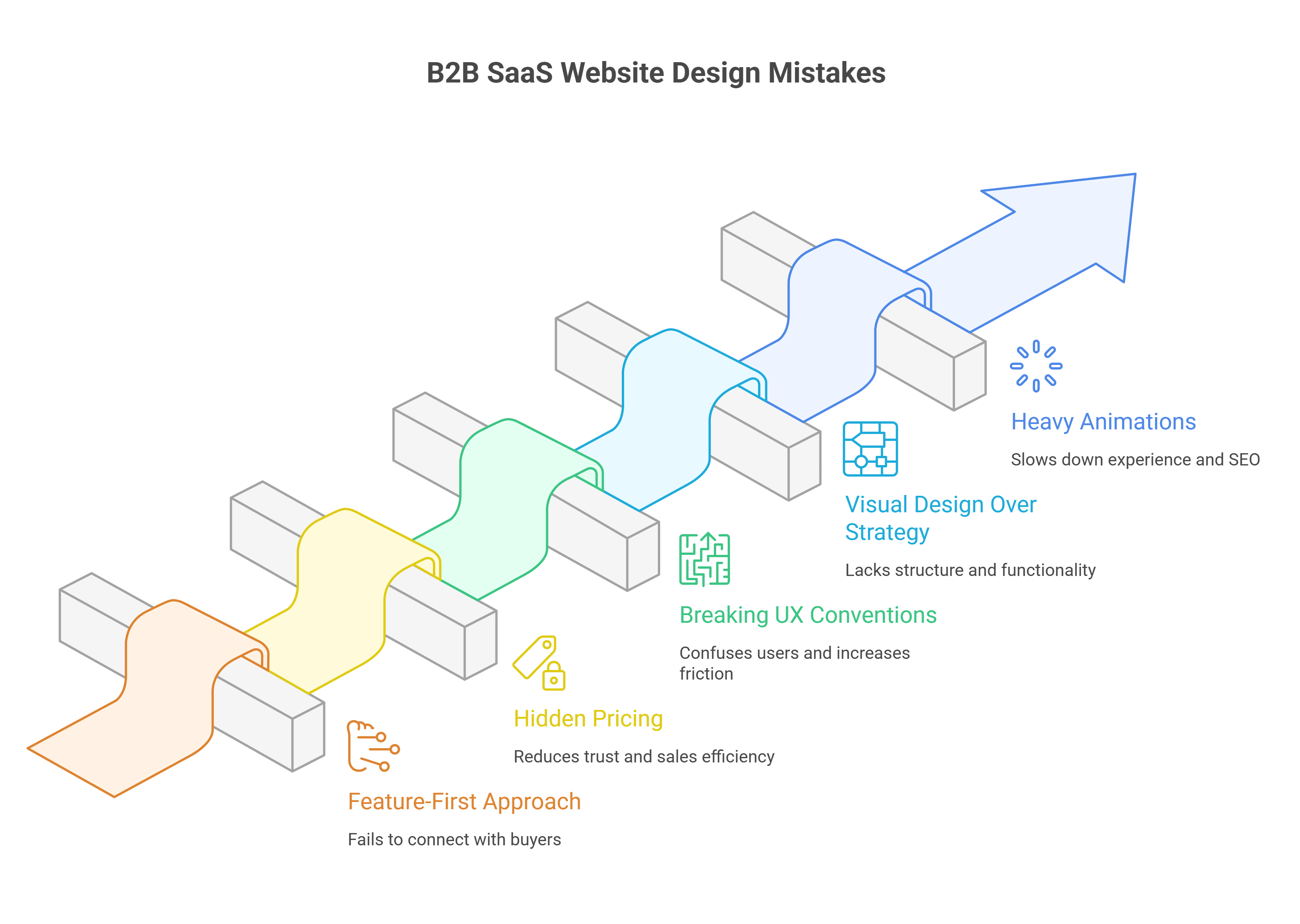
Mistake #1: Leading with features instead of customer outcomes
Most B2B SaaS websites open with a carousel of capabilities. Up-to-the-minute dashboards, AI-driven alerts, one-click workflows. The assumption is that quantity equals quality. Buyers will see all these features and understand the value. They won't.
Why feature lists fail to convert
Features don't persuade because they're attributes, not arguments. You force the buyer to connect meaning to function on their own when you lead with what your product does. Decision fatigue is high in B2B and stakes are higher. Most won't bother. They'll move on to something they understand right away.
Research shows buyers don't assign value to features in isolation. They mentally tie features to outcomes they care about, outcomes that protect them from regret. The feature list becomes noise when that context is missing. 76% of enterprise customers have discussed outcomes with their technology providers at some point, signalling where buyer priorities are heading.
The quiet flaw in feature-first positioning is that it outsources the heavy lifting to the buyer. You're asking them to infer the effect. Inference isn't persuasion. Features can help justify a decision after someone has already moved towards your product, but they cannot create that initial desire. People buy based on emotion more than logic, then their subconscious rationalises the choice.
This saas website design mistake shows up across the industry. Companies assume features carry value on their own. They don't. Your web design mistakes compound without showing the buyer what problem gets solved and why that matters. The visitor closes the tab.
How to structure benefit-first messaging
The hierarchy should run like this: here's your problem, here's how life looks when it's solved, here's what makes our product the vehicle to get you there. Benefits answer the question every buyer is asking in silence, 'What will this do for me?'
Start with the outcome. Don't open with 'boards, lists, and cards' if you're selling project management software. Open with 'organise projects without the chaos'. That speaks to the desired state. Features validate the decision once belief is there. They reinforce the logic the buyer is already forming.
You also need to connect each feature back to its benefit. Don't just say 'our software integrates with over 50 platforms'. Say 'connect all your tools in one place to make your workflow efficient'. The feature is the mechanism. The benefit is the result. Both matter, but the benefit comes first.
Companies with strong value propositions grow faster and retain customers longer. The proper sequence is strategy, then structure, then copy, then visuals. You're decorating a house with no foundation if you're designing before defining your messaging hierarchy.
Examples of outcome-driven positioning that works
Slack changed from talking about 'up-to-the-minute messaging' to how teams stay aligned, cooperate and boost productivity. The feature didn't change. The framing did. Trello followed a similar path and moved from 'boards, lists, and cards' to 'organise projects in a fun, flexible way'. Asana stopped listing task management features and started focusing on 'achieve more together' and 'reduce work about work'.
The pattern is consistent. Outcome-based positioning frames your product around the use case and the result the customer wants to achieve. It's not about the product itself. It's about what the customer accomplishes with it.
This change in saas website design separates sites that convert from sites that don't. You speak to where your most-wanted customer is right now when you position outcomes first. You give them the information they need in the language they use. Features still appear, but they support the story instead of leading it.
Mistake #2: Hiding your pricing from qualified prospects
'Contact us for pricing' is one of the fastest ways to lose a qualified buyer. Someone lands on your pricing page and signals intent. They want to know if your product fits their budget before investing time in a demo. Force them through a form just to get a ballpark figure and many won't bother. They'll leave and find a competitor who respects their time enough to answer the question upfront.
Why 'contact sales' reduces trust
Hiding pricing creates friction right away. Buyers can't find cost information and assume you're either too expensive or that you're going to waste their time with a hard sales pitch. Neither assumption helps you win deals.
Research backs this up. 70% of SaaS buyers abandon a site when pricing is unclear. That's not a small leak in your funnel. That's a gaping hole. The moment you hide pricing behind a gate, you're telling the buyer: 'I don't trust you with this information yet'. That lack of trust flows both ways.
The price you pay for this approach is credibility. 87% of B2B purchasers want to self-serve part or all of their buying journey. Block that path and you're not protecting your margins. You're pushing well-qualified prospects towards competitors who provide the clarity you're withholding.
Showing pricing vs. hiding it
Not every product needs public pricing, but the decision should be strategic, not defensive. You're selling commoditized offerings with standardised features? Show the price. Your product requires heavy customisation or you're closing deals over £500,000 in annual contract value? A 'contact sales' approach makes sense.
The most effective model is hybrid. Display pricing for foundational tiers and reserve custom pricing for enterprise deals. This builds trust through visible pricing and still supports complex requirements. Salesforce demonstrates this well by showing specific pricing for basic through business plans, then offering enterprise solutions through sales contact.
You can also tailor transparency to engagement level. Show logged-in users more detailed pricing than anonymous visitors. This approach protects competitive intelligence and still gives serious prospects the information they need to move forward.
How transparent pricing qualifies better leads
The main benefit of transparent pricing isn't lead volume. It's sales efficiency and lead quality. Visitors see your pricing and still choose to engage? They're more likely to be serious about purchasing. You've already filtered out prospects whose budgets don't line up.
This natural qualification process saves time on both sides. Transparent pricing can reduce the sales cycle by up to 30% by eliminating lengthy negotiations and back-and-forth. Buyers come into conversations with clarity and confidence. They've already decided your pricing fits their budget. Now they want to confirm the product delivers.
Companies that line up their pricing transparency strategy with their business model see 30% better conversion rates than those who follow industry norms without strategic consideration. The data also shows that transparent pricing can increase perceived trustworthiness by up to 50% among potential customers.
Full transparency feels risky? Start with a 'starting at' figure. Even a single reference point allows buyers to self-qualify and avoids total guesswork. That baseline sets clear expectations and philtres out prospects whose budgets aren't lined up, saving both sides time.
Mistake #3: Breaking standard UX conventions to look different
Differentiation sounds appealing until it costs you conversions. Many B2B teams redesign their websites with the goal of standing out and creating something memorable that sets them apart from competitors. The result is often a site that looks impressive in internal meetings but confuses actual buyers. Familiar designs feel accessible to users, while creative deviations from standard patterns force visitors to stop, reassess, and often guess where to find what they just need.
To break UX conventions that users know well isn't just annoying, it's expensive. Bucknell University redesigned their website with minimalist, hidden navigation, and the results were clear. Users couldn't find simple information like majors offered or tuition costs. One participant found the list of majors once during usability testing but couldn't retrace his steps to locate it again. Everybody complained about the navigation, with one prospective student stating: "I think it's cool, it's very modern looking. But I really wish that it was like a conventional college site that has at the top Academics, Financial Aid, everything like that. This was much harder to navigate".
Navigation patterns users expect
Standard navigation exists because it works. Users expect to find a primary menu at the top of the page with clear, descriptive labels. Your menu should contain fewer than eight links to prevent overwhelming visitors. Simple, goal-focused labels matter more than creative copy here.
Hidden navigation under vague labels creates friction. Minimalist and hidden navigation frustrated users during testing and prevented them from finding information. Content becomes less discoverable when users can't see their options without additional clicks. Interaction costs increase, and cognitive load compounds.
CTA design that converts without confusion
Generic CTAs like "Learn More" or "Get Started" fail because they don't tell users what happens next. Descriptive text that explains what the user receives when they click performs better. Swapping vague buttons for specific CTAs like "Download the SEO Checklist" increased click-through rates by over 30%.
First-person phrasing improves conversion rates by up to 90%. "Start my trial" outperforms "Start your trial" by creating a sense of ownership that nudges users towards action. CTAs should use imperative verbs (Download, Read, Start) to shorten the cognitive distance between seeing the button and taking action.
Footer elements that support conversion goals
Footers serve as a final chance to guide visitors who've scrolled through your content. Everything in them should include navigation links to key pages, contact information, social media icons, newsletter sign-ups and CTAs. A sitemap helps both users and search engines understand your site structure.
CTAs positioned in the footer prompt users to take action even after they've consumed the main content. This gives passive scrollers a final chance to convert without scrolling back up.
Mobile responsiveness as a baseline requirement
Over 63% of global web traffic comes from mobile devices. Mobile users guide themselves with their thumbs, so buttons need to be large enough for easy one-handed interaction. Apple suggests touch targets of at least 44×44 pixels. Simplified navigation that reduces cognitive effort and minimised load times are non-negotiable.
A site that loads within one second has a conversion rate 2.5 times higher than one that takes five seconds to load. Then responsive design isn't about shrinking desktop layouts, it demands intentional choices that prioritise mobile users from the start.
Mistake #4: Prioritising visual design over strategy
Design teams often reach for colour palettes and typography before answering simple questions about who they're designing for. The visual layer feels like progress. But you're building a facade with no structure behind it without strategic groundwork. This saas website design mistake wastes time and budget because the whole design gets scrapped once strategy emerges.
Why wireframes come before mockups
Wireframes are simple blueprints that show where elements like headers, buttons, text and images will go on each page. They strip everything down so you can focus on structure without visual distraction. Wireframes let you test whether calls to action are clear and navigation makes sense before you commit to polished mockups.
You make a common saas website design mistake when you jump straight into visual design without planning how a website will function. You miss the chance to plan how visitors will interact with your site when you skip wireframes. You also miss what information they'll need and how to guide them towards conversion. Wireframes keep strategy lean. They enable collaboration between team members and help identify gaps early.
Defining your ICP before designing pages
Your ICP informs everything from messaging to page structure. Specificity matters. A CEO targeting B2B companies with 100 to 700 employees is casting too wide a net. A company with 101 employees and one with 699 has massive differences in maturity and organisation. You can't target both with the same message.
The more detailed your ICP, the more likely you'll find customers that fit your business. This focus allows you to craft messages that capture attention instead of generic positioning that speaks to everyone and persuades no-one.
Mapping the customer journey first
Journey mapping visualises the process a person goes through to accomplish a goal. Page designs become guesswork without understanding how users move through buying stages. Mapping forces conversation and creates an aligned mental model for the whole team.
The correct order: strategy, structure, copy, then visuals
Strategy comes before scope, and scope comes before structure. Copy dictates design, not the other way around. Websites built to address buyer needs rather than company specifications perform better. Start with who you're targeting and what problems your site needs to solve. Then wireframe, then write copy, then apply visuals.
Mistake #5: Adding friction with heavy animations and company-focused content
Heavy animations and company-centric content create the same problem: they add weight without adding value. Both slow down the experience and distract from what matters, solving the buyer's problem.
How animation overload hurts page speed and SEO
Code added to your site slows down loading speeds. Page speed is a ranking factor for search engines like Google, so poorly optimised animations directly affect visibility. Heavy animations increase page load times, which causes higher bounce rates and damages SEO rankings.
CSS-based animations are more efficient than JavaScript-heavy alternatives. Browsers can render motion smoothly with minimal processing overhead. Lazy loading will give animations the ability to load only when visible in the viewport and improve performance for below-the-fold content. Micro-interactions should not exceed 500ms. Quick animations delight users, but longer durations become friction when repeated dozens of times per day.
Flashy visuals can undermine trust and performance beyond technical impacts. Design elements that don't support your conversion funnel do more harm than good.
Common B2B SaaS Website Design Mistakes (and How to Avoid Them)
Keeping 'about us' content off high-intent pages
The homepage, service pages and pricing pages aren't the place for founding stories or team size. Visitors on those pages have one question: "Can this help me?" An About Us page that takes a company-centric approach fails to appeal to users. Lead with the buyer's problem on high-intent pages, not your company's history.
Where company storytelling belongs on your website
Company storytelling belongs on your dedicated About page. That's where curious prospects go to decide if you're legitimate. Your mission, team photos, customer testimonials and social proof belong there. Keep everything else focused on the customer's problem and how you solve it.
Conclusion
Every mistake we've covered traces back to one root cause: websites that talk about themselves instead of talking to the customer. Features without benefits and hidden pricing change focus away from the visitor and towards the business. Company stories on conversion pages do the same.
The fix is simpler than it seems. Start with strategy before visuals. Lead with outcomes, not capabilities. Show pricing where possible. Respect proven UX patterns. Keep the customer's problem front and centre on every high-intent page.
Get these fundamentals right, and your site will convert visitors.
FAQs
What are the most common web design mistakes B2B SaaS companies should avoid? The most frequent mistakes include leading with product features instead of customer outcomes, hiding pricing information behind contact forms, breaking standard UX conventions to appear unique, prioritising visual design before strategy, and adding heavy animations that slow page speed. These errors typically stem from focusing on the company rather than addressing the customer's needs.
Why is transparent pricing important for B2B SaaS websites? Transparent pricing builds trust and improves lead quality. When pricing is hidden, 70% of SaaS buyers abandon the site, assuming the product is either too expensive or that they'll face aggressive sales tactics. Displaying pricing upfront can reduce sales cycles by up to 30% and increase conversion rates by 30%, as it allows prospects to self-qualify before engaging with sales teams.
Should B2B SaaS websites follow standard navigation patterns or create unique designs? Websites should follow established UX conventions rather than breaking them for creativity. Standard navigation patterns work because users already understand them, reducing cognitive load and improving conversion rates. Hidden or minimalist navigation consistently frustrates users in testing and prevents them from finding essential information, ultimately harming conversion rates.
What is the correct order for designing a B2B SaaS website? The proper sequence is strategy first, then structure, followed by copy, and finally visuals. This means defining your ideal customer profile and mapping their journey before creating wireframes. Copy should dictate design, not the other way around. Jumping straight to visual design without strategic groundwork wastes time and budget, as the entire design often needs scrapping once strategy emerges.
How do heavy animations affect B2B SaaS website performance? Heavy animations slow page loading speeds, which directly impacts SEO rankings and user experience. Sites that load in one second have conversion rates 2.5 times higher than those taking five seconds. Poorly optimised animations increase bounce rates and damage search engine visibility. Animations should be CSS-based rather than JavaScript-heavy, and micro-interactions should not exceed 500ms to avoid creating friction.

We’ll review your website, identify conversion gaps, and outline a practical plan to turn it into a qualified lead engine.