How Fintech Websites Build Trust Through Design and Content
Learn how fintech website design builds trust with clear content, secure UX, social proof, and fast Webflow performance. Book a call with Flowscape now.
We’ll review your website, identify conversion gaps, and outline a practical plan to turn it into a qualified lead engine.


In fintech, trust isn't a feature: it's the product. Your website has five seconds to convince a visitor their money, data, and financial future are safe with you. Design and content either make that case or lose the lead permanently.
Key things to know:
- Why fintech websites fall into Google's YMYL category and what that means for design and content decisions
- How visual consistency across every page signals stability and builds brand credibility with cautious buyers
- The role of security indicators (SSL badges, compliance certifications, and transparent data policies) in reducing visitor anxiety
- Why social proof in fintech works differently than in other industries, and how to structure it for maximum impact
- How plain-language content and jargon-free microcopy turn complex financial concepts into conversion-ready clarity
- The connection between page speed and perceived product reliability, and why a 2–3 second delay can cut registrations by 20–30%
- Why regulatory credentials and licensing information belong in the decision zone, not buried in the footer
- How a content strategy built around education and transparency compounds trust over time
For fintech companies, the website isn't just a marketing asset: it's the first compliance check visitors run on your brand. Before anyone signs up, shares card details, or books a demo, they decide whether to trust you. That decision happens on your website, in seconds, based on what they see and read. Getting this right is the difference between traffic that converts and traffic that disappears.
Why Trust Is the Core Conversion Challenge in Fintech
Fintech operates in a category Google formally classifies as YMYL (Your Money, Your Life). This means your website is held to stricter standards than a SaaS product or an e-commerce store. Users arrive with skepticism built in. They've heard about data breaches, hidden fees, and collapsed platforms. They're not comparing features first. They're deciding whether to trust you at all.
This creates a conversion dynamic unlike most B2B or consumer markets. Traffic doesn't convert in fintech unless trust comes first. A technically brilliant product with a cluttered, vague, or inconsistent website will lose leads to a simpler competitor that simply feels more reliable. Design and content are the mechanism through which trust is established before a single sales conversation happens.
The five-second credibility test
Visitors make a trust assessment within the first five seconds of landing on a fintech website. In that window, they're not reading. They're feeling. Is this site clean and professional? Does it look like something I'd find at my bank, or something that went live last week? Are there logos I recognise? Does it load fast?
This initial impression is shaped almost entirely by design: visual hierarchy, spacing, color palette, and typography. Fintech websites that use calm, professional color schemes, typically blues, greens, and neutrals, perform better on this test because those palettes carry cultural associations with stability and reliability. Dark mode works well for premium or crypto-facing brands, but only when executed with precision. Inconsistent design across pages, mismatched fonts, or slow image loads all signal instability, and in financial services, instability is a disqualifying signal.
Design Elements That Communicate Security and Stability
Visual consistency as a trust signal
Consistency across a fintech website tells visitors: this brand is deliberate, reliable, and not going anywhere. A design system (standardized components, spacing, typography, and iconography used uniformly across every page) communicates the same qualities users want from a financial partner. When buttons look different on different pages, or when the hero section feels disconnected from the pricing page, visitors register it subconsciously as a lack of care.
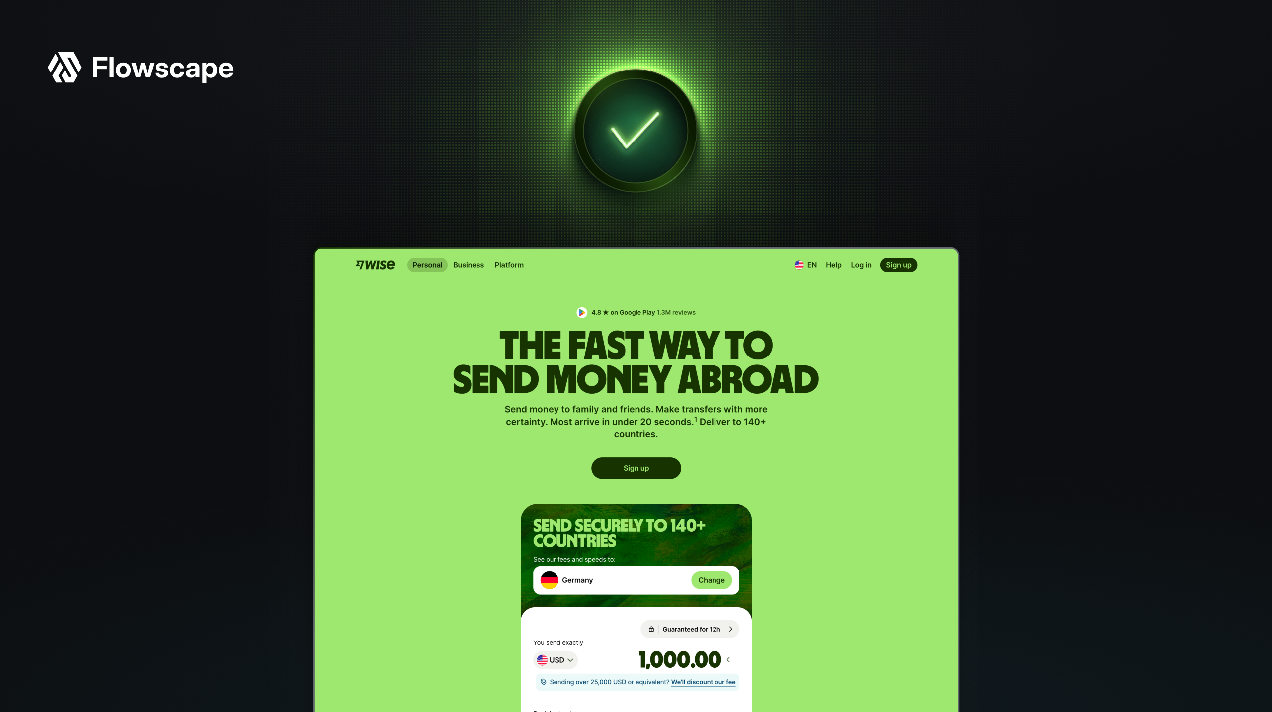
The most trusted fintech brands, including Wise, Revolut, and Stripe, invest heavily in design systems precisely because visual coherence is a proxy for operational coherence. For a growing fintech, this is achievable without a massive team. Webflow's component-based architecture, for example, lets a lean team maintain design consistency at scale without rebuilding every page from scratch. The result is a website that feels as stable as the product it represents.
Security credentials in the decision zone
SSL badges, regulatory certifications, and compliance indicators are standard on fintech websites, but placement matters more than presence. Trust signals work best when they appear in the decision zone: the area of the page where a visitor is deciding whether to sign up, request a demo, or share financial information.
Burying a SOC 2 certification in the footer is a missed opportunity. Positioning regulatory credentials, active licenses, and security badges near CTAs and onboarding entry points reinforces confidence at exactly the moment it's needed. Leading fintech platforms pair client quotes with compliance signals in the same viewport, creating what designers call a layered trust architecture, where social proof and security credentials reinforce each other simultaneously.
Page speed as a reliability signal
Load time is a trust signal in fintech in a way it isn't in other industries. A slow website doesn't just frustrate users: it implies the product might be slow too. Research consistently shows that a 2–3 second delay on a fintech onboarding screen can reduce completed registrations by 20–30%. For a company investing in paid acquisition, that's a significant percentage of marketing spend evaporating before the first interaction.
Fast-loading fintech websites built on performance-optimised infrastructure (global CDN, compressed assets, clean code output) signal technical competence to both users and search engines. Core Web Vitals are a direct ranking factor for YMYL content, meaning page speed improvements compound into organic visibility gains as well as conversion rate improvements.
Content Strategy That Converts Cautious Buyers
Plain language over financial jargon
Complex financial language is a conversion killer. When users encounter terms they don't immediately understand, such as APR structures, AML compliance layers, or counterparty risk, their first instinct isn't to look it up. It's to leave. Fintech websites that write in plain, direct language convert better because they reduce the cognitive friction that erodes trust.
This applies to every content layer: headlines, body copy, pricing explanations, onboarding instructions, and error messages. Wise built a significant portion of its early growth on radical fee transparency, showing users exactly what they'd pay, in simple language, before committing. That clarity became a competitive advantage. The standard for fintech content in 2026 is simple: if a non-expert reader can't understand it on first reading, rewrite it.
Social proof structured for the fintech buyer
Social proof operates differently in fintech than in most industries. Generic five-star reviews move the needle in e-commerce. In financial services, buyers look for specific, verifiable credibility signals: the name and title of a real person at a recognisable company, a measurable outcome, and context that matches their own situation.
Data supports the investment: 93% of consumers say online reviews impact their purchase decisions, and websites with meaningful user-generated content see 29% higher conversion rates. For B2B fintech, this means case studies built around concrete metrics (cost reductions, processing speed improvements, compliance outcomes) rather than vague satisfaction statements. A testimonial from a CFO at a named company describing a specific result is worth ten anonymous five-star ratings.
Placement matters here too. Testimonials embedded on product feature pages, near pricing sections, and alongside CTAs outperform testimonials collected on a standalone reviews page. The goal is to surface social proof where the decision is being made.
Transparent content builds compounding authority
Fintech buyers research extensively before making contact. A content strategy that answers their real questions about how your platform handles security incidents, what regulatory framework you operate under, how fees are calculated, and what happens to their data does two things simultaneously: it reduces sales friction by educating prospects before the first call, and it builds the kind of domain authority that earns sustained organic visibility in a YMYL category.
Blog content, explainer articles, and help documentation that address compliance questions, security architecture, and product mechanics aren't just SEO assets. They're trust infrastructure. Every piece of content that answers a skeptical buyer's question before they ask it moves them closer to conversion. Fintech companies that treat their content strategy as a trust-building mechanism, rather than a traffic acquisition play, consistently outperform those that publish for volume alone.
Bringing It Together: Design, Content, and the Conversion System
The fintech websites that convert best treat design and content as a single system rather than separate workstreams. Visual hierarchy guides the eye toward trust signals and CTAs. Plain-language content answers objections before they surface. Social proof appears in context, at the moment of decision. Performance and security signals reinforce each other at every touchpoint.
This is not a one-time launch exercise. Fintech markets move fast, regulatory contexts evolve, and buyer expectations rise every year. The websites that maintain conversion performance over time are those built on flexible, maintainable platforms where content updates, A/B tests, and design iterations happen without developer dependency. That operational agility, the ability to move as fast as the market, is as important as the initial design quality.
For fintech companies building or rebuilding their web presence, the strategic question isn't aesthetic. It's structural: does this website give us the speed and control to keep trust-building current, or does every change require a ticket and a wait? The answer to that question will determine how well the site performs six months after launch, not just on day one.
If you're a fintech company looking to turn your website into a genuine conversion asset, Flowscape's B2B web design service is built for exactly this challenge, combining conversion strategy, design, and Webflow development into one system that launches in weeks, not months.
FAQs
What design elements build the most trust on a fintech website? The highest-impact trust elements are visual consistency across all pages, security credentials (SSL, SOC 2, regulatory licenses) placed near CTAs rather than in the footer, fast page load times, and real social proof from named clients with specific outcomes. Together, these create a layered trust architecture where each signal reinforces the others. Design quality itself, including clean layouts, professional typography, and deliberate spacing, signals competence before a visitor reads a single word.
How does page speed affect trust in fintech specifically? In fintech, slow load times don't just frustrate users: they imply product instability. Research shows a 2–3 second delay on a fintech onboarding screen reduces completed registrations by 20–30%. Users associate the speed and precision of a website with the reliability of the underlying financial product. Fast, performance-optimised fintech websites built on CDN infrastructure signal technical competence and increase both conversions and organic search rankings through improved Core Web Vitals scores.
Why is plain-language content important for fintech conversions? Fintech buyers are cautious and research-heavy. Complex financial jargon increases cognitive friction and triggers the impulse to leave rather than engage. Websites written in plain, direct language reduce that friction, allowing visitors to understand the product's value and trust the team behind it before committing to a conversation. Transparent fee explanations, clear onboarding instructions, and jargon-free product descriptions have a direct and measurable impact on conversion rates, particularly for products targeting non-expert financial buyers.
How should fintech companies use social proof on their website? Effective fintech social proof is specific, verifiable, and contextually placed. Named testimonials from identifiable individuals at recognisable companies, paired with concrete outcomes like cost reductions, processing improvements, or compliance results, significantly outperform anonymous ratings. Placement matters as much as content: social proof embedded on feature pages and near CTAs converts better than testimonials isolated on a standalone reviews page. For B2B fintech, case studies with measurable metrics are the highest-trust format available.
What content strategy works best for building long-term trust in fintech? A content strategy focused on answering real buyer questions about security architecture, regulatory compliance, fee structures, and data handling builds compounding trust over time. This type of content educates prospects before the first sales call, reducing friction and shortening sales cycles, while simultaneously building domain authority in Google's YMYL category. Fintech companies that treat content as trust infrastructure rather than a traffic channel consistently outperform those publishing for volume. Depth, accuracy, and transparency matter more than frequency.

We’ll review your website, identify conversion gaps, and outline a practical plan to turn it into a qualified lead engine.